

Interview
Self-taught US designer Jack Werner Stauffacher is a master of the craft of printing, and has been a major influence on the private press movement in the US. He has published remarkable books and limited editions under the Greenwood Press, which he founded in San Francisco in 1947.
Exposed to avant-garde art, film and literature by his film-maker brother Frank Stauffacher, Jack developed a particular sense of design in which a love of the classics is combined with an appreciation for modernity and innovation. In 1955, he began a three-year-long Fulbright scholarship in Italy, where he met master printers Giovanni Mardersteig and Alberto Tallone whose work and ideas influenced him deeply.
As a fervent advocate of clarity and restrained typography, his influence on his students, apprentices and colleagues has been enduring. One such example is Jim Faris, who in 1974 received a grant to join the Greenwood Press as an apprentice. While there, he assisted Stauffacher in the creation his edition of Plato’s Phaedrus, which was to become one of the most celebrated publications of the press.
Having heard of the Schule für Gestaltung Basel from his mentor, Faris joined the programme in 1976. There, his appreciation for Jan Tschichold’s typography was questioned by tutor Wolfgang Weingart, who rebelled against Swiss typography and despised classic design. Nonetheless, Faris developed a series of stunning and experimental technology-themed collages, in Weingart’s classes, which were published in Typografische Monatsblätter (TM) in 1979.
Upon his return to the US, Faris worked at Ciba-Geigy Corporation and at the Museum of Modern Art (MoMA), both in New York. In 1985, he opened the design firm AlbenFaris Inc., with Lauralee Alben. Five years later, they moved their practice to California, specialising in the design of interactive experiences for clients such as Apple (including the emblematic identity for Mac OS), IBM, Netscape and Sony. Faris thus became part of the first generation of practitioners to face the challenge of designing for interactive media, as opposed to working in print, and he continues to work for high-tech corporations such as Google and Skype.
Jack Stauffacher So you are looking at TM in the period after Emil Ruder designed for it? I always admired Tschichold, he has been so influential to my generation. But what really intrigued me is when he became the asymmetry-God. He wrote this book in the early 1930s and it became the bible for modernist constructivist typography. And when he was older and came back to Switzerland after working for Penguin in England, he started then to look at things with symmetry. The people in Basel were puzzled. The Rhine goes right through there. The city was divided. This is a bit of exaggeration but there was the symmetrical school on one bank and the asymmetrical on the other, and they wouldn’t talk to each other. They became maniac.
Jim Faris Like me?
JS No, not like you. I am trying to exaggerate here!
JF When you went to study at the Schule für Gestaltung Basel, you met all of those people – Ruder, Hofmann and Tschichold – and you sensed that? That they were not on good speaking terms?
JS Oh yeah. Ruder was in a beautiful white smock in his typography lab. Everything was so pure and one side of me totally admired it. They take this seriously. I read his book and I was influenced by it. I bought a lot of the Univers typeface. I read about its designer, Adrian Frutiger. I was immersed in that – but there was part of me that was into symmetry also. Maybe because as a printer I could do both. As a printer, I never went to school to learn, I learned by observing and using my press, I am kind of self-taught. I was lucky to be able to see both sides of that debate, rather than become totally immersed in one.
JF Republican or democrat?!
Alex Chew So you are centrist!
Louise Paradis Jim, did you meet all of the greats when you were in Europe?
JS I had a marvellous time at Tschichold’s house. He had a beautiful library and he pulled out all of these wonderful books. And I asked him if he could show me the original asymmetry book. He said, “Oh Jack, that was my sinful period.” After his Penguin period, he became very – I mean he never lost his eye for well-set text. His work was always so beautiful and meticulous. He just knew how to use space and text.
JF I was very influenced by Jack, who was influenced by Tschichold. And very soon after I started studying in Basel, Weingart, for whatever reasons, decided to talk about Tschichold. It was almost like a lecture-style speech. He was just viciously attacking Tschichold, and it went even to the chandelier Tschichold had in his house – it was so kitschy and in such bad taste. It was devastating. I was so depressed after that. I knew that part of that was related to what Jack mentioned earlier, a division between the promoters of symmetrical and asymmetrical typography and this new modernist approach of typography. Weingart was really in that camp, and he even got me on his side, to follow Ruder and have a more experimental path. Eventually I stayed in Switzerland and I overlooked that problem. I might even have talked to Weingart about that. So years later, Weingart published a page in Emigré magazine and he reversed his opinion. He did a symmetrical page and totally accepted the genius of Tschichold, of his asymmetrical and symmetrical pieces. So, the controversy died down over the years.
LP When you decided to go to Basel, did you know about Weingart teaching?
JF Yes, and I thought it was very exciting and I had not thought much about how controversial the issue of symmetry would be, or how little attention we would pay to historical examples.
LP Do you totally reject all the past?
JF For me, Jack’s career was a very good model, because he studied Renaissance books but he was also very interested in modernity and experimented throughout his work. For me it was never an either/or kind of political position.
LP I was wondering if you knew about Weingart teaching at the school because I read somewhere that some students were very surprised to find him there instead of Ruder.
JF Those students were probably just a bit ahead of me. By the time I got there, I realised that there was something great going on there, but it was not the Ruder programme anymore. But we were mostly familiar with the Ruder foundation, which I learned about from Jack. That was the true Swiss typography. But that was a bit of a shock, the kinds of questions Weingart was asking, it was beyond what I had anticipated. During the time I was there, Weingart gave a lot of lectures and became famous worldwide. He surprised me too with how far he went against tradition. It was Armin Hofmann who brought him in and allowed such a radical change to happen, which was really interesting. I think it was a very important decision on Hofmann’s part. They had a choice to open the window and look at other things or just follow in the pedagogical tradition, which would have been so easy to do. If they had done that, the school in Basel wouldn’t have been so interesting in the late 1970s and 80s. It was genius to bring this guy from Germany in with his totally different perspective.
LP The main editor of TM, Rudolf Hostettler was really interested in different discourses that he would put together in his magazine.
JF I never met him but I think he was very open-minded. He made it possible for Weingart to do all these issues. I think Weingart had an agreement with the magazine that he could do whatever he wanted. He also published student works. André Gürtler also contributed to the magazine on different articles around the same time. I was in touch with Weingart recently because I wanted to get the original transparencies of my TM contribution. I would like to continue it one day. I knew he still has all that stuff because he is an extraordinary archivist. He never throws anything away.
LP Did you know André Gürtler too?
JF He was my teacher too.
JS I invited him to give a talk at Santa Cruz University. It was a catastrophe. Not because of him but we had some problems … Long story.
JF Yes, Jack invited them. I think I was still a student at that time. They came over, Christian Mengelt, André Gürtler, and another colleague. They were actually on a lecture tour.
JS Landor, there was another catastrophe there.
JF Yes, in those days Landor’s office was on a boat, a big beautiful ferry boat. There were a hundred people on the boat. Walter had his personal office and meeting room there. So André Gürtler and Christian Mengelt were giving a lecture in the morning at Landor, which is about an hour and a half from Santa Cruz. And for some reason, the carrousel they were using fell on the floor and the slides went everywhere.
JS Those slides were not American, they were of a special Swiss format – bigger. And they couldn’t put them back in order.
JF They didn’t have time either, because they had to get to Santa Cruz. They gave the lecture with the slides in the wrong order; some were upside down too. They were completely distraught after that, because of course they had been really well prepared. And to make their trip worse, they lost their airline tickets to go back to Switzerland. Their flight was leaving that night from San Francisco. They remembered they had stopped to buy gasoline on the way to Santa Cruz, so they drove back to the gas station. They looked everywhere and eventually they found their tickets out in the street. They were able to catch their flight.
JS André did a lot of beautiful collaborations with TM. He did research about the history of typography, articles about his trips with students to Rome, inscriptions in different places … I was very impressed by his collection and the way he taught type history.
LP Do you still have that magazine with the history of typography?
JS I gave part of my collection to the University in San Francisco. Maybe I saved that issue just because I liked it so much. I will give it to them later because I am still using it. I am not that retired you know.
JF Are you retiring soon?
JS Well, not really, just slowing down. But what would I do? Sit at home, stare at the walls?
JF You could enjoy the view?
JS No, no, no.
JF For me Jack is definitively part of the story too, because he was my teacher and he told me about the school in Basel. And without him I am sure I would have never heard of that programme. It was fairly well known in the US, but not to everybody.
JS When you had your own studio, you did the Mac OS logo! Please tell me about it.
JF Well, we were doing a lot of work for Apple at the time. It was when Apple thought they were going to license the operating system to other manufacturers. So they needed to have a logo for the operating system itself. They ended up picking this logo I did. Probably of all the work I have done, this icon had has had the longest life. It’s been redrawn, but it’s still the same basic form.
LP Everybody knows that logo!
JF We had a really good relationship with Apple in the 90s. We learned a lot about software and interface design. When we were in New York, we were doing more traditional work like identity and print work. And when we moved the practice to California in 1990, we set a goal that 90% of our work would be interactive. That was really aggressive, but it happened in about a year. We often think about these issues, what’s going to happen to the book, what’s going to happen to print … Now that the book is being used as a digital device also. It is a complicated question, but it is clear that it is not just about technology or the attribute of the physical book versus the digital book. It is also about what’s going on in here [points to his head]: the whole cognitive and sensual relationship to an environment. So it is something like if you see a play in a theatre or captured on film. Those are two totally different experiences but it is literally the same exact material. It’s the same with text on a digital device or printed on paper.
AC Have you read Walter Benjamin on the aura? The aura of an object of art and state of mechanical reproduction. Is a printed book considered a piece of art? Is film considered a piece of art? Because you are only experiencing it in a certain way. I think there is an aura around a book. The effect that a book has on your psyche, and the atmosphere that an e-book doesn’t have. I think people might have difficulty in the end. In a book you can flip pages and on an iBook it is a totally different thing. It is very linear in a way.
JF I will look for that Walter Benjamin text, because I am pretty sure that we are not attached to a book for sentimental reasons at all.
JS You are too modern, no sentiments at all, no love of the beautiful objects.
JF You have to be careful with that stuff.
JS Oh, I love it!
JF I think it is part of a larger problem. I think the biggest problem is what happens to our relationship to language. Something is changing and it is for the worse and it is happening very radically. It has a lot to do with our attention and with depth. The book has a tendency of really focusing and presenting coherent ideas. Probably because it was isolated and bound, it was limited. And the limitless condition of the digital means we are always influenced randomly. It is very hard to follow continual thoughts. One thing links to another, which is great, but not always. Also, you used to have a deep relationship with an author. You would say I am reading him or I am reading her, not a book. It is almost like you have a relationship to a person. I think it is possible to maintain this in a digital world, but it is more difficult.
AC With the internet and the anonymity of information, you can read a news article and you don’t really care who wrote it.
LP Were a lot of people aware of TM in the US?
JS On the West Coast, nobody. I shared it through my connections and my fellow printers. Maybe in New York or Chicago, but not here. What you are seeing, is one typographer who walked into European concerns with things I was concerned with. The equivalent of this kind of magazine in this country was so far away, so basic, it had no sense of aesthetic and was just pretty dull. This TM was a “printer’s publication”, but it had an aesthetic: the way it presented the articles, the kind of spirit. It wasn’t just totally a machine, it was also what the machine printed, the result of that. It showed design.
LP So you were one of the very few who knew about it?
JS I am not saying I was the only one, but I was one of the very few.
LP I heard that few people knew of TM in the US: it was little pockets here and there. I am just trying to have a better idea of that network.
JS I can’t tell you exactly, but when TM came every month it was like a cultural energiser for me. I was isolated and I always was so happy to get this material. I also bought a couple of Italian equivalents of TM, French and the English as well, but they were not as good as. Herbert Spencer was the editor of one of the English magazines. These magazines were my teachers.
JF Here in San Francisco at the same time there was a kind of antiquarians press movement. This was very historical, people wanted to make books like they did in the Renaissance, or like William Morris. It was very backward looking, very conservative.
LP Could you receive TM only by subscription?
JS Yes, that is why I was one of the few.
LP Did you come across TM through Jack, as you were his student?
JF For sure. I spent a year with Jack printing a book.
LP Did you decide to study in Basel after this year with Jack?
JF I actually decided I would go to school soon after I graduated, but after my graduation I got a grant from the National Endowment for the Arts – they were paying me to work with Jack. So I postponed my time in Basel.
LP How long were you at Basel?
JF Two and a half years.
LP Who were your tutors?
JF Hofmann, Weingart, Kurt Hauert in drawing, Peter von Arx in film, Max Schmidt in graphic design. Schmidt was a famous designer for Geigy. And André Gürtler for letterform design. We had 3D classes the first year too. I think Weingart and Hofmann were at the heart of it all, along with Hauert who is not as well known. Drawing was the foundation of the Basel programme.
LP You mentioned that there were a lot of international students. Was it mostly non-Swiss?
JF There were some Swiss in that advanced class programme, but they mostly went to the Fachklasse, the normal programme. They would not really need to go to that advanced programme. It was mostly Americans.
LP A lot of Canadians?
JF Yes, because they got generous scholarships: they would get some 5,000 Swiss Francs a year, which at that time was quite a good amount of money. You could live very comfortably. One of them now is in Los Angeles, Leah Hoffmitz, teaching at Art Center in Pasadena. A lot of them went to the office of Gottschalk+Ash. It was the kind of place everybody who went to Basel wanted to work for.
LP After your time in Basel, did you go back to the US?
JF I actually went to England for one year and taught at a school there, Ravensbourne College of Art and Design, a bit outside of London. Then I came back to to New York for 10 years. I worked for Geigy for five years. They had their American headquarters in New York. After that I worked as a designer for MoMA for about a year.
JS He was such a hip designer, top position!
JF Oh it might look good from the outside but there was a lot of inside politics, very complicated. The MoMA was actually pretty conservative. Then I started my own studio in New York and, as mentioned, then moved to California from the early-to-late 1990s, where we worked for Apple. I kind of stopped doing design for a couple years and did more consulting and management. American corporate design culture is still not very sophisticated; it is getting better.
LP After that you worked for Google?
JF Yes, but previous to that I worked as a consultant for a brief time for Motorola, a bit over a year. I was there when they developed their first Android phone. I was then able to go to Google. It has been a bit more than a year now. It is a very interesting company, very busy, chaotic and very creative. You can create and ship some products very rapidly. It is exciting but it is a challenge to keep the quality of work.
LP It is funny to look at your piece in TM, because you also talked about a shift of technology, not the digital one, but from lead to phototypesetting. How did those changes in technology affect you?
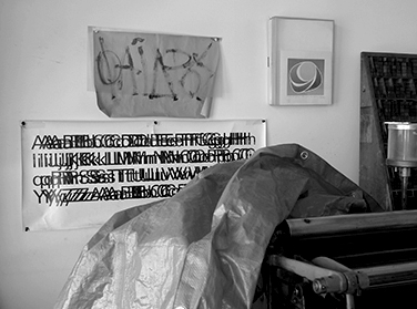
JF That was the whole point of that series, to meditate on the change of technology and how these changes affect us. It is not a neutral thing at all if you change the tool. The idea was about sensibility, your feeling for the thing. It was at the time when lead was becoming less important; now all the letterpress technology has been removed from the school in Basel, which I think is just pitiful. I think they should have left it there because if you don’t ever touch the lead, you lose a whole sense of the thing, the typographic space. It is like being a chef without tasting.
LP I think there is this movement in graphic design that is trying to reconnect with more craft work: small presses, doing all these smaller special editions.
JF On one piece of work I was looking at, once you move away from composing by hand to photocomposing, the piece would be different. The sense of space, the margins would be different, because with lead composing you had clear boundaries and with photocomposition you don’t have it anymore.
LP For the work you’ve described you used a text by Mallarmé. Why was that?
JF Oh yes, I used that Mallarmé text. That was another of Jack’s influences.
LP When you got to Basel, was it the beginning of that transition to photocomposition?
JF Sort of. Well it has been around for some years. Just getting to the mainstream. There were still some commercial letterpress at that time, but things were going more and more towards photo-based technologies.
LP How did your collaboration with TM happen? Did you propose it to them?
JF I was working in Weingart’s class. I was very influenced by Gregory Vines. He was working on that series on Bellinzona. I thought, this is so beautiful. He made a typographic interpretation of a castle door. But I wanted to think only about the typographic space. So I started to work on something and at some point Weingart told me, work harder and maybe we can do a TM issue of the work. Then Gregory started to use some of my films in his collages too. Weingart made a book of those collages, by Gregory and me. You know this book, right? Look, he signed it, “For my best student, Pepper Steak.” OK, this is some very important information, take a picture of that! Ah!
LP Pepper Steak?
JF That was my nickname, long story.
LP So you know Gregory pretty well?
JF Yes, our desks were literally side by side. I told Greg one day that I should put his shoulder in my collage because I was always looking over his shoulder when he was at work. Greg was so talented. I was quoting his work to some extent. I was inspired by it.
LP He stayed in Basel, right?
JF Yes, he still teaches at Basel. How can that happen! But you know, people make different choices. Oh and look here, he made a map of Switzerland with crumpled paper.
LP Did you speak German before going to Basel?
JF I learned a little bit of Swiss German. I picked up quite a bit. At the end I was speaking in German with my teachers. I got by, but I had pretty bad German in general.
LP I wish I could speak and write German, because so many articles in TM are in German.
JF I am sure Switzerland has changed since I was there, but it was so amazing to be in Basel and see all the signage in Helvetica everywhere and everything so clean and well designed. For a kid like me who grew up in Los Angeles, it was mind-blowing. It really suited me at that point. I loved the Swiss design, the modernist era with the strict Ruder design. It took some time for me to see the possibilities in Weingart’s experimentations. For sure I thought it was really exciting, but I couldn’t make it my own in a way. Then I think it got out of control too after the 1980s, the whole postmodern thing. For me it just lost its originality and became a fashion, not about ideas. I never really became a part of that.
LP So you were not part of the people who came back to Basel and developed this idea of the New Wave, like April Greiman for example?
JF There were some people, like April Greiman, Dan Friedman, and lots of others, who took those ideas and pushed them and did really beautiful things with them. I wasn’t really one of them. I stayed on a more traditional Swiss design path.
LP So you don’t consider yourself part of that movement?
JF No, not really. I was doing more mainstream stuff for Geigy and MoMA. That was at the period when, if you wanted good type, you had to set it in lead, then print it on paper and photograph it after. Because for a long time, phototypesetting was still very bad quality and that was the only way to make it nice.
JF Jack, you should bring along the issue where your work was published in Emigré, because it is actually the best article about Jack.
JS Here is a poster I designed for Yves Zimmermann. He was a gentleman doing typography in Spain. This was 1960. I invited him to come to the school in Pittsburgh.
LP When were you in Italy?
JS From 1955 to 58.
LP Did you meet the people at the Nebiolo Foundry?
JS Yes, I did meet the most famous one …
LP Aldo Novarese?!
JS Yes! I got a signed book, it is at the University of California, Berkeley, now.
JF Jack gave boxes and boxes of books to the university. Can you imagine? We practically couldn’t walk around here before.
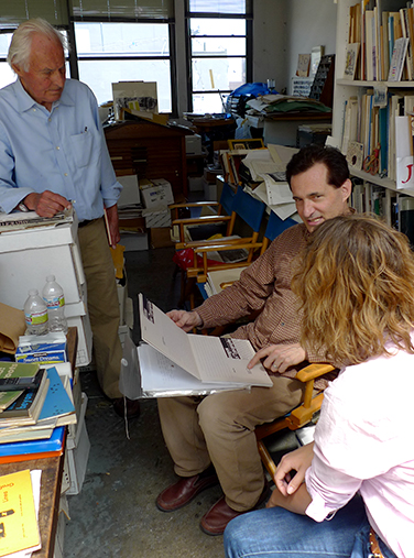
JS Now we are going to show you the Phaedrus book, that talks about language. It is kind of the same discussion we had earlier about the physical book and e-book, except, in this book, it is about oral language and writing. The same kind of technological problem.
JF There is a very interesting book about the manuscript period called In the Vineyard of the Text: A commentary to Hugh’s Didascalicon, by Ivan Illich.
JF [Looking at LP’s research book] That is my first wife, Lauralee Alben. She did the Superman collage. She was inspiring to me, because she was this young kid. She got published right away by Weingart and I was a little bit jealous [laughter]. So that made me work harder.
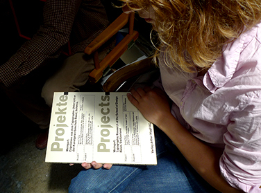
Conducted by Louise Paradis. The above conversation took place in San Francisco, California, in July 2010. It was copy-edited by Roland Früh and Ariella Yedgar.