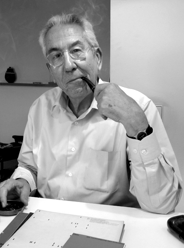

Interview
A Swiss typographer and graphic designer, Yves Zimmermann became a key figure in many most important pedagogical and publishing ventures and he also greatly contributed to the graphic landscape of Barcelona by working on many projects in the business and institutional sectors.
Zimmermann studied at the Schule für Gestaltung Basel under Emil Ruder, who had a lasting effect on the younger designer’s approach, and over the years he designed some of the most striking covers of Typografische Monatsblätter, notably the cover series for the year of 1958 and the first and second covers of 1960.
Following the completion of his studies, Zimmermann moved to New York City and worked for graphic designer Will Burtin, and architect Ulrich Franzen, eventually joining the Geigy Chemical Corporation. This new position led to a series of relocations, from New York City to Montreal, Basel, and, in 1961, Barcelona, where he established his graphic design studio in 1968. In 1975 he approached the Barcelona-based publisher Gustavo Gili regarding series of books about design, as he was aware that there were no reference books on the subject in Spanish. In response, Gili created the Colección Comunicación Visual, which covered a wide range of topics, including cinema, architecture, design, art, semiotics, and visual communication. In 1979, as it became evident which books in the series were most popular, the publisher launched the GG Diseño collection, inviting Zimmermann to be its responsible.
Regardless of the Franco regime, Zimmermann strove to create and produce distinct work which have played such a major part in introducing and winning social and cultural recognition for graphic design in Spain since the 60s. His enthusiastic and adventurous spirit, combined with a distinct modern and rational approach inherited from Emil Ruder and the Schule für Gestaltung Basel, proved successful in many projects.
Yves Zimmermann I have always been passionate about books. After giving four years of design classes at the Escola Superior de Disseny i Enginyeria de Barcelona, I realized that there was no bibliography, no books, about photography, design, or typography in Spanish. So I decided to go see a publisher that I knew, called Gustavo Gili, who is very well known in the Spanish publishing world. The headquarters are here in Barcelona, but there also offices in Mexico and South America. They only published professional books about architecture, engineering, art, etc. So I arranged an interview and made the following proposition to him: “I have been teaching design classes and observed that there exists no bibliography in Spanish on design and typography. It is very important that you, who has a specialized publishing house, do something about it.” He said, “I don’t know the market for this kind of books. You know what? We could initiate a collection, but on a more extensive thematic.” So we then invited several people—an architect, a painter, a semiologist—and, together with Gili and me, created the collection Visual Communication. We published books about typography, photography, design, and related subjects such as semiology, psychology, etc. All together we published between 40 and 60 books. So, after four years we knew the market: What was selling were design and other subjects related to it. Gili then asked me if I would like to take care of a specific design collection, to which I agreed with pleasure. I selected the subjects and titles of books I had read in English, German, and French. It was the first collection about design in Spanish, and it received well in Spain and in all of South America. The collection still exists today, but unfortunately Gili died, and so now it is his daughter who continues to run the publishing house. One of the books to whose birth I am very proud to have contributed is … Do you know Otl Aicher?
Louise Paradis Yes.
YZ Well, I had the honor of meeting Otl Aicher. Unfortunately, he died too early. I recommended to Gili to translate his book The World as Design into Spanish. Gili looked at it and said, flipping through the book in its German version, “There are no images in it, and you know that design books without images don’t sell.” I answered, “Yes, I know, but this man is one of the very few thinkers in our profession! We need to publish it. I will pay for the translation and you for the printing.” After some discussion he agreed to my proposal. Then the odyssey of the translation started. As is well known, the first letter of a noun is capitalized in German. But Aicher had eliminated capitals. Even after a period he would write in lower case. I had the intuition that this might cause some problem, so I asked the translator to do only one chapter. And looking at the first paragraph of the translation, I had to correct so much with a red pen that in the end it looked like a bloody battlefield. I still had to reject two more translators after that, because they were confused by the lack of capital letters … And they said they were translators! … Finally I found someone who made a splendid translation, and after a year and a half Gili called me and said, “I have to do another print run of the Olt Aicher book because it has sold out.” And now that book is on its sixth or seventh reprint!
LP How do you position Typografische Monatsblätter in the context of graphic design and typography between 1965 and 85? In other words, was it an important magazine for you?
YZ In the context of typography it was the magazine.
LP Were there other magazines you looked at?
YZ The only other magazine that I remember was Graphis. I think TM was the only magazine to discuss typography.
LP There was a certain period when Rudolf Hostettler and Emil Ruder were close.
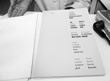
YZ Yes, I think so. I don’t remember very well, but I believe they were friends. Ruder was a typography teacher. I believe he designed entire issues of TM. Because there were not only competitions for the covers, but also for the inside grid. For the series of covers I did in 1958 I also did the inside grids of the magazine. The covers were in relation to the grid, they are a kind of visualizations of what’s going on inside.
LP I would like to know more about those covers of 1960, because I read an article saying that they were controversial at the time. Only two of the series of covers you designed were published. What happened?
YZ It is because in terms of the German language they are full of mistakes. Instead of “Monats” and “Blätter,” I wrote these words phonetically, not gramatically: “MONAT” and “BLTR”.
LP I found this article in TM about the competition for the covers for 1960. The members of the jury wrote small comments. It is mostly in German though.
YZ [Translating the article] “The projects of Yves Zimmermann are, typographically speaking, excellent, but I believe that in regard to grammar they are going to face some resistance. However, as an experiment, I would like them to be produced. But before the appearance of these covers, we should inform our readers of the experimental form of the work. Is it a twist of fate that the month of March is spelled Merz, which is the name of the famous Dada magazine?”
LP Were you referencing Dada?
YZ No, no. I continue: “This Dada movement, which 40 years ago considered itself a revolt against convention, does not necessarily have validity today. And even less does it have its place in a technical magazine which has articles dedicated to language and grammar. An above-average typographic solution should be feasible without this vulgar violation of the language. In consequence, I share the same idea as my three other colleagues, which is to publish these covers on a page inside the magazine that would explain the experimental form of this series.”
LP Were these covers the result of a competition?
YZ If I remember well, following the first series of covers I did, in 1958, TM asked me to produce a new series of covers, so it was not the result of a competition.
LP So you proposed that series?
YZ Yes, this big violation of language, yes.
LP What typeface did you use? Is it Akzidenz Grotesk?
YZ Yes. It was the typeface of the moment. The modern Grotesk typeface. In fact, there was nothing else. There was Futura. It is only later that Univers came out, and also Frutiger. Yes, back in the day it was either Akzidenz or Futura.
LP What about the typeface Monotype Grotesque 215?
YZ Monotype Grotesque 215 only had small letters, for text or books, for example, not for posters in 24 or 36 point.
LP What about Helvetica?
YZ There was Akzidenz, and then I heard that Haas Type Foundry in Basel did a design based on it. They introduced a couple of changes. I used it, of course, here in Barcelona, for example, but I really liked Univers and Frutiger. Univers had such a wonderful program. It was really important when it came out.
LP When did you go to the Schule für Gestaltung Basel?
YZ From 1956 or 57, to 61.
LP In Helmut Schmid’s book he talks about some special classes given by Emil Ruder to only two or three students a year.
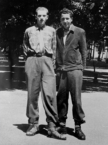
YZ Emil Ruder was my typography teacher. There was also Mr. Robert Büchler, who was also a typography teacher. I had Armin Hofmann as well. But I have to tell you first that since the beginning I wanted to be a graphic designer. And when I presented myself at the school it was full. I had to wait four years for some availability. You know, the Schule für Gestaltung Basel and the Schule für Gestaltung Zurich were very important. They are where Swiss design was born. So I wanted to design and I decided to go for typography. I studied together with my friend André Gürtler.
LP Who was the strongest influence on you?
YZ Ruder!
LP Why?
YZ My father was very strict, and Ruder liked what I was doing. He was very understanding. Even … well that is another thing. At the printer where I was working, there was a secretary from Russia, and I often went to play cards with her husband. I would talk to them about Ruder. That he took us to the museum and explained Picasso to us, etc. I was very enthusiastic about it. They answered: “Oh, modern art, what is that?” With a very pejorative attitude. I don’t remember exactly how it happened, but they invited Ruder one evening. All I remember from that event is that he ended up winning the discussion about modern art. He had a way of approaching things. He took care of us in a certain way. For example, if I experienced something bad at home, he would come over and look at me and ask: “How are you Mr. Zimmermann? Is everything OK?” Inwardly I adopted him as a father.
LP Did you go to the museum often? Was it part of the class or would you go after class?
YZ Instead of one hour of class he would say, “Meet me at the Kunstmuseum Basel [the museum of modern art] on Thursday at X hour.” Through these visits and his explanations he introduced us to modern art! I will remember Emil Ruder until the last day of my life. André Gürtler had a similar passion. Following those visits to the museum, one summer, I think it was in 1957 or 58, André and I decided to go visit Mr. Picasso. On our bikes! From Basel we crossed the Gotthard Pass and went to Vallauris, in the south of France, where they were making beautiful pottery. Some of this pottery was made according models by Picasso. Each of us bought a piece of this pottery and also a poster made by him. The poster was a drawing which Picasso had cut in linoleum, and presented some figures on a brown background. It took us a bit of effort to find the villa, near Cannes, where Picasso was living. When we finally found it I rang the doorbell and a housemaid answered. I told her, “We are two students from Basel and we should like to visit Mr. Picasso.” She said, “I am sorry but he is not here.” I said, “Can we leave our two posters and could he sign them please?” She answered, “Well, come back tomorrow.” The next morning, we rang the doorbell and the same lady answered. We asked, “Is Mr. Picasso here?” She said, “Yes, but he is going to leave in a few minutes. He signed your posters. Here they are.” We waited outside, and five minutes later another door opened and we saw a sports car with Picasso in it. He waved to us and left. So we brought our precious posters back to Basel. On the first day of class, we put both our posters on the desk of our admired master without saying a word. Then he said in German something that means approximately you little punks! It was the greatest honor.
LP What was Armin Hofmann’s class like? What kind of exercises did you do?
YZ I remember only one exercise: the cover for a vinyl record. We had to draw it on a lithography stone to be able to print it. I still have it somewhere.
LP What about Mr. Büchler?
YZ Robert Büchler was a really good man, a good teacher, but he didn’t have the charisma of Ruder.
LP When you were in Basel, was everything done by hand, using lead type?
YZ Yes.
LP Were there other technologies?
YZ There was the Monotype and the Linotype. The Linotype was used for the composition of newspaper text. It involved melting a line of lead all at once. With the Monotype all the letters were independent. It was for books, for more refined work than newspapers, if I can put it like that.
LP Did you learn both of them?
YZ No, that was another specialty. We were learning to compose text by hand. For example, the space between two words was normally one third of the body size of the type. If the type size was 10 point, then we would create a 10 x 10 point square and divide it by a third, a quarter, etc. There were specific norms. A comma at the end of a word would create more white space, so we had to put less space there than a normal space without a comma. The goal was to have a visually uniform surface, a uniform gray of text, without white holes.
LP Was the reputation of Basel in part because of the precision and attention to detail in typography?
YZ The Schule für Gestaltung Zürich also had this reputation. The famous Swiss design, as I told you before, was born at the Basel and Zurich schools.
LP But Basel and Zurich were different. I heard that Zurich and Basel were in competition.
YZ But this is independent from design.
LP In the context of Typografische Monatsblätter, work by famous designers from Zurich, like Josef Müller-Brockmann or Carlos Vivarelli, was not shown. It was mostly work from Basel. Hans Rudolf Bosshard and Hans-Rudolf Lutz are exceptions though.
YZ But at that time there was also Graphis, where they published a lot of work by Zurich graduates.
LP And also Neue Grafik, from 1958 to 65. You said earlier that you wanted to be a graphic designer at the beginning. For my generation, the professions of graphic designer and typographer have more or less merged. But for your generation, they were two distinct professions.
YZ Yes, that has happened since the printing industry, as I used to know it, stopped existing.
LP Over your whole career, have you considered yourself more a graphic designer or a typographer?
YZ More a graphic designer, given the work I have done throughout my career.
LP After graduating from the Schule für Gestaltung Basel you went to Montreal and New York. Can you tell me more about that time?
YZ I went to New York first, then Montreal. Well, one day, as I was finishing the school year, Ruder came to me and said, “Mr. Zimmermann, would you like to go to New York?” I said, “What? How come?!” He answered, “There is a designer who is offering a position to a student. Will Burtin!” He had a graphic-design studio, and he was looking for somebody. What I really wanted to do was to design, but I had no idea about a lot of things. Often the boss would say to me, “OK, Yves, you’re gonna take this package to this street, and afterwards you will sweep the floor.” I was so frustrated that I would get home at night and invent some projects for myself. To do design! At the end of that year, it became clear that I would go back to Switzerland. I sent everything back there and I only kept the essentials. I decided to go to Mexico before leaving America because I had seen some Mayan pyramids in one or other book. At that time I didn’t speak a bit of Spanish. I traveled by bus to México city and from there to Oaxaca, and there I visited some Zapotec ruins. Later on I continued my trip further south to some place in the jungle where the bus could go no further because the road ended there. So I decided to continue walking on a footpath through the woods … then, terrifyingly, I got completely lost in the jungle. I walked about eight hours until I arrived in a little hamlet next to a river, where I was able to sleep in some house. The next day a man led me down the river to a train station where I boarded a train to Yucatan. There I was able to visit the marvelous pyramids. When I finally went back to New York I felt like I was hugged by the city. After this experience of being lost in the jungle, New York seemed to me so nice and welcoming. This experience had completely changed me. I had already sent all my stuff back to Switzerland, but suddenly that city that I didn’t like that much because I was frustrated with my job was not the same to me anymore, it meant protection, to be back at home. At that time I knew a young woman and one day before I left we agreed to see each other. She then told me that she just had visited an architect who was looking for a designer but she didn’t like the job because she was an artist and not a designer. Suddenly I asked her to give me his phone number. I called him right away, and luckily he was still in his office at this hour. I told him that I heard he was looking for a designer and that I was a Swiss designer. He said, “A Swiss designer? Come by right away.” He explained what he needed and asked if I was interested. I said yes. That same night, the woman who was going to be my wife, Bignia, had organized a party for my departure. And when I arrived at the party I yelled, “I am not leaving!” Years later, after our wedding she told me that that night, she thought to herself that if I stayed something would happen between us. And it did; a year or so later we were married …
LP How long did you stay in New York?
YZ When I got to New York I met a fellow student from Basel. He eventually became art director at the pharmaceutical company Geigy, which at that time was well known for its graphic design of pharmaceutical propaganda. He asked me if I wanted to work for him, and of course I said yes, but I knew I had to go back to Switzerland soon. One day I got a draft letter from the Swiss military saying that I had to present myself to the Swiss army. Back in Basel I asked my supervisor at the Geigy company if there were other branches of Geigy where they needed a designer. He said, “Yes, yes. We have branches in Paris, Milan, South Africa, Barcelona, etc, etc.” For me, all of these places were great, the most important thing was to get out of Switzerland, out of its narrow-mindedness. One day, he mentioned Barcelona and that I could go there for one year, and I said, “Perfect.”
LP So when did you go to Montreal?
YZ That was during my time in New York, when I was working for Geigy. They asked me to go Montreal to create a design studio over there. I ended up staying there for six months.
LP But in Montreal at that time nobody was really doing design, or very few. Was it a similar situation in Barcelona?
YZ Yes, it was new at the time, especially in Barcelona in the early 1960s. For example, a professional organization of artist-designers had organized an exhibition as a result of a competition where designers had to create a perfume advertisement. I think in total there were 12 entries, and 11 of them were paintings! It was abstract paintings! The last one was a photograph. And of course it won. At that time, to do design was the equivalent of doing art! Let’s say it was applied art, you applied art to something that had to be sold.
LP So you went to New York, Montreal, New York again, Switzerland, and finally Barcelona.
YZ In New York Bignia and I felt so free! No pressure from parents, etc. Returning to Switzerland we felt a bit trapped. So we decided to travel a bit more before really establishing ourselves. Barcelona was supposed to be only for one year. And at the end of my first year there my chief asked me, “Why don’t you stay for two more years? You are doing good work and people appreciate you.” After five years in this company I wanted a change, the work there was a bit repetitive, so I decided to start my own studio.
LP Was it during this time that you started to teach?
YZ I started to teach as soon as I arrived, in 1962. I did it for four years and then an event happened. There was a teacher who specialized in cinema. One day, he was discussing the career of Pier Paolo Pasolini, the Italian director who was a communist, and the teacher mentioned this to the students. This occurred in the 1960s, during the dictatorship of Francisco Franco. Their worst enemy was communism. One day, the director asked us to fire this teacher, because apparently a young woman was so traumatized by this lecture on Pasolini that she had to go see a psychologist! We refused to fire him, and a major rupture happened. The majority of the teachers left, and we started a new school. Today, the two schools still exist. They have changed a lot since then, because they got included in the international university program, and today you can graduate as a doctor in graphic design from there! Can you believe it?! It makes me laugh. Back in the day we did things with our hands. Our hands! And today, what are hands for? I read in one of Martin Heidegger’s books that we think because we have hands!
LP During the span of your career, there have been incredible developments in technology. You started with lead type, then …
YZ … Monotype, Linotype, photocomposition …
LP … and then the computer! Were you excited about it? Did it modify your way of working?
YZ The big rupture happened with the computer, this is clear. Before that there was evolution, but it still involved using hands. We would do drawings, sketches—original drawings—and then with the computer everything changed. The hand has no role to play anymore, except for manipulating the mouse. The hand doesn’t have the experiences anymore, for example when we wanted to do a mock-up for a book cover we would prepare the gouache with water then paint the surface and decide where to place the text with Letraset … All that is from the Paleolithic period today. Also writing by hand. I translated three books, two by Martin Heidegger, and I still have the manuscripts all written by hand.
LP Who are your favorite designers?
YZ I really admire Karl Gerstner, because he is a very intelligent man who invented, let’s say, programs. I even published one of his books, Programme entwerfen, into Spanish. His idea was not to find one solution to one problem, because one problem can have many solutions. He invented programs that created many solutions to a problem. So you can choose which solution is the most appropriate. He made the spectrum of possibilities larger. He did admirable designs as well. Josef Müller-Brockmann was also someone I admired. I also edited a book of his in Spanish. I also admired Otl Aicher very much, not only as a designer but as a person too. For his ethics. He was also one of the founders of the Hochschule fur Gestaltung Ulm.
LP Have you ever visited the Hochschule fur Gestaltung Ulm?
YZ Yes, I went once with my wife many years ago. It was before I had the honor of meeting Aicher.
LP In the 1960s, were the most important schools the ones in Ulm and Basel?
YZ Ulm, Basel, and Zürich too, with Josef Müller-Brockmann.
LP Do you think it is important for a designer to have a particular style?
YZ No. For me the designer is an interpreter. A client who has a communication problem asks for the help of a designer. This client has to inform the designer what kind of public he wants to reach, if it is male, female, what are the social and intellectual characteristics, etc. And then the client has to tell me what is the idea he wants to transmit to this group. The job of the designer is to interpret this verbal information into signs which will have to be interpretable by the group we focus on. So, as a designer I couldn’t put myself forward, I have to interpret this message in my own way. Of course, since I had an issue—X—and I approached the problem of interpretation in a certain way—Y—so, for example in Spain, which didn’t have a school like Basel, the impact of what I was producing was highly noticeable. So people would say, “Oh, this is Zimmermann’s style.” But it is not my style, it is my way, from my learning in Basel, to reduce the complexity of a problem to the most simple and efficient elements. This is something I discussed with a lady colleague who is a teacher at the school of art here: the relation between art and design. We decided to make a book about this subject. We then asked six Spanish and six South-American designers to write 10 to 15 pages about the question, “Is there a relation between art and design?” It was a successful book. In conclusion, I think we can say that art is one thing and design is something else, even though from some perspectives you can see design as part of art history. I once asked a friend of mine who is a painter what is his process in making a new painting. He told me that he prepares the canvas and then stands in front of it until he is as empty as the blank canvas, and when he reaches this moment then he lets the “canvas paint itself”. To him, nobody says how or what to paint and for what purpose. That is a fundamental difference to design.
LP Wolfgang Weingart started to produce work during the period of TM that I am looking at. I find it interesting, since he mastered typography but used it as if it was an art work. There was no real client behind it. His TM cover series of 1972–73 was quite striking. What do you think of those cover designs?
YZ Yes, this is a typographic experimentation that can please or not. I don’t reject it, but it doesn’t particularly interest me. It is typographic art, I guess we can call it that. I was in Barcelona already then. I think I didn’t subscribe to the magazine anymore, but André Gürtler, my good friend who I would visit in Basel from time to time, showed me those covers. I saw them like graphic experimentations. It didn’t shock me or particularly please me. You can do this kind of thing in a typographic magazine. It’s the same as what I did for the TM covers of 1960, experimenting with typography. It is to see typography as art: “I do this that way.” I am saying that without being cynical.
LP What do you think of the notion that form must follow function?
YZ Every object has a purpose to fulfill. So the form must be appropriate to be able to achieve it. A friend of mine did a book about the 100 most successful design objects. They are mostly simple, general objects. We don’t usually talk about them, because they do what they have to do and we just don’t even notice them. But when you look at them closely, you realized that they are beautiful. That was the big problem of the design boom of the 1980s, when the designers forgot that objects must fulfill a function. They contorted objects into art pieces. The 80s were really harmful for design in that way. Here in Spain they contributed to the bad reputation of design. When you wanted to criticize something you would say, for example, “That is a such a designer chair.” Or, “This guy really has a design discourse,” meaning that he creates beautiful sentences with nothing behind them, no ideas. I remember years ago, seeing in the newspaper that the popular right party said it had centered itself. And in the newspaper they used the headline, “It is a design center.” Meaning they wanted people to believe they had moved to the center, but were in fact on the right.
LP The word design became pejorative.
YZ That is what designers in the 80s created. Superficiality. That is what people started to think about design, and the fault is with the designers themselves. They didn’t want to make design, they wanted to make art and become famous. And the truth is the designer must disappear behind his work. There shouldn’t be any egotism.
The above conversation took place in Barcelona in March 2012. It was copy-edited by Ariella Yedgar.